What an editorial design skill changes
The package contains design tokens, component treatments, layout rules, motion guidance and reference examples. It gives the agent a consistent vocabulary for headlines, tables, buttons and navigation across a landing page and an application screen.
This direction suits publications, research tools and SaaS products that want a considered, reading-led feel. It is not the first choice for a playful consumer app or a dense real-time operations console. The product page lists both good and poor fits.
Read the comparison with its limits
The pair below is Taste Stack’s published Ledgerline example: a fictional bookkeeping product, built from the same brief with and without Editorial. The brief asks for a landing page and dashboard, and does not specify fonts, color or mood. The product page also shows the desktop and phone results.
This is first-party evidence for that brief and the validation conditions listed on the product page. It is not an independent benchmark, a conversion-rate test or a guarantee that another model will produce the same design. Use your own product brief to decide whether the change is useful.
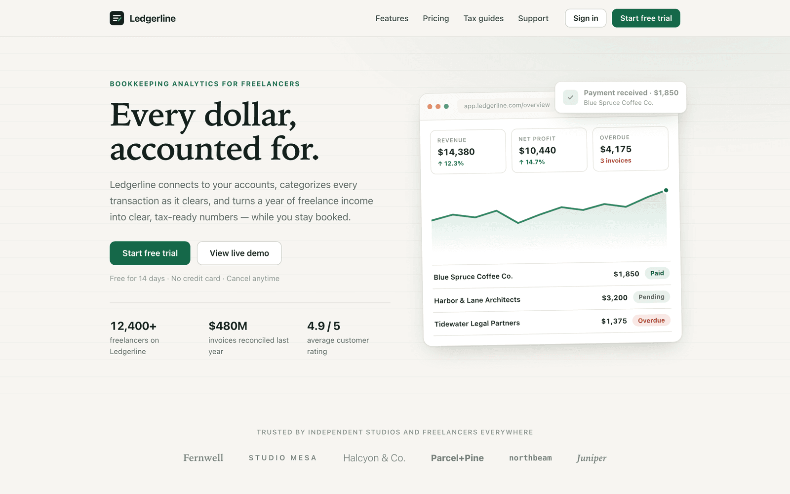
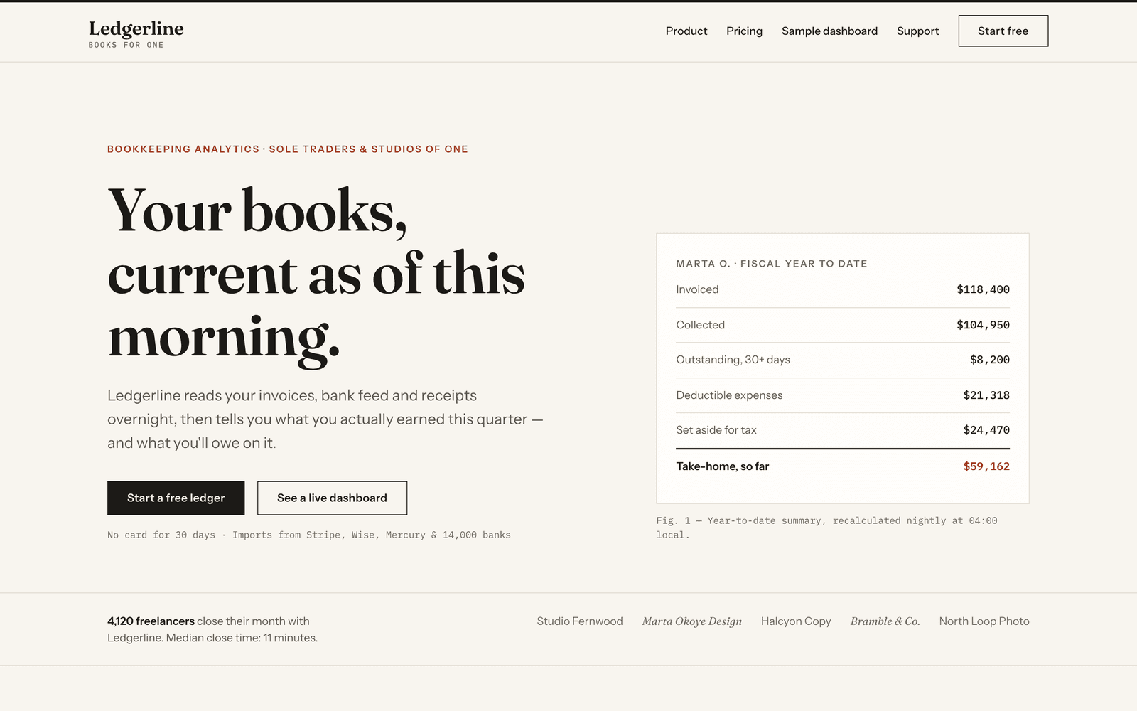
Build a small static site for Ledgerline, a fictional bookkeeping analytics product for freelancers: index.html (landing page) and dashboard.html (app screen), sharing one stylesheet styles.css. No frameworks, no build step, vanilla HTML/CSS (a few lines of JS allowed for menu/toggles).
Landing page: top navigation, hero with headline + subline + primary and secondary CTA, a logos/social-proof strip, three feature sections, pricing (three tiers, one highlighted), a closing CTA, and a footer with columns.
Dashboard: app shell with side or top navigation, page header, four stat cards (revenue, expenses, profit, overdue invoices), a revenue-over-time chart (inline SVG is fine), a recent-invoices table (≥ 8 rows: client, date, amount, status), and an activity feed.
Both pages must work at mobile and desktop widths. Use realistic copy and numbers, not lorem ipsum. Make it polished and production-quality.
It never mentions style, fonts, color or mood. Every bit of taste in B comes from the skill.
Install, then build with your own content
Editorial can be bought once or used with Pro; the product page shows the current price and license. You still need a compatible coding agent. If you want to test the install workflow before buying, Swiss, Midnight, Soft Depth and House Blend are free with an account.
After purchase, sign in with the checkout email. On the Editorial page, choose your agent and paste the generated install prompt. Ask the agent to read the skill and confirm its non-negotiables before it starts. The setup guide explains per-project and machine-wide installation.
Use the installed taste-editorial skill to build my product site. Keep the product facts and navigation I provide. Use its tokens and component rules for both the landing page and dashboard. Do not replace the identity with a framework’s default cards. After building, list any places where my content required a layout change, and check the longest headings and table values at phone width.Review more than the hero
Check the page where the content gets difficult: a long feature title, three pricing tiers, a real table, an error message and a narrow viewport. Typography should explain the hierarchy; a serif headline alone does not make the whole interface editorial.
- Confirm the intended font actually loaded; a fallback can change line wraps and spacing.
- Reuse the same color, type and spacing tokens on the application screen. Watch for a second, unrelated button or shadow system.
- Check the page with realistic content rather than the exemplar’s wording. Do not copy its fictional customer names or figures into your product.
- Test forms, keyboard navigation and contrast independently of the visual judgment.
Editorial or Swiss?
Choose Editorial when a distinctive serif voice and reading rhythm support your product. Choose Swiss when one grotesk family, strict alignment and a cooler, more systematic feel fit better. These are choices of visual direction, not a ranking of which skill is universally better.
A general frontend-design skill can help an agent choose a direction for an open brief. A taste skill is useful when you want to choose a specific direction in advance. If the project already has a design system, keeping its real components and tokens may be a better option than introducing either.
Continue with a real project
Open Editorial to inspect the current package, price, license and supported agents. For another direction, compare Swiss and Editorial.
Related field guides
Sources and scope
This is Taste Stack’s own product guidance. The package files and published product examples are the source for its visual rules. The suggested prompts are exercises, not additional completed benchmarks.